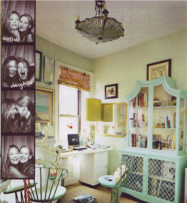
Celerie's office was also shot for the premiere issue of Domino, and it's interesting to see how much it's changed since 2005. If you look at the carpet it appears to be the same space (and both articles say Celerie's "New York office") so I'd be interested to see how she incorporated the two styles. BTW- I'm head over heels in love with the bookcase- especially the color!
Celerie's own line of furniture at Lane Venture has some pieces with a similar Asian feel. They're beautiful, but personally I think I'd rather hunt down a piece like this at a flea market ;)


5 comments:
I'll have to pick up a copy of that...the top image is lovely!
I loved the first version -- part of what sold me on Domino -- but the newer look is so chic. Adore the desk!
Some of those pieces are just stunning. I see what you mean about the asian feel. Beautiful.
Oooh! I LOVE this office! So Chic! I need to go get In Style pronto! I hope I won't be hasty and buy a copy since I do get a subscription to the magazine :)
Post a Comment